
This blog post is designed to help fellow independently published authors improve the quality of their work, but most of the tips here apply to the formatting of any book. I’m speaking of the formatting of books for the consumption of readers, not formatting your manuscript to send off to an agent or publisher. There are a whole other set of rules for that exercise.
I’ve put together a list of ten tips that you should consider when putting your book together. They are not in order of priority, but together, they can make your book stand out from the millions of others available through your favorite sales channel.
1. Put Some Thought Into Your Cover
I have to admit, this was something I didn’t waste a lot of time on when I published my first book, Frankly Speaking. I just went ahead and used the Kindle cover creator and cranked out a generic cover. I’m not proud, but I’ll share with you what the original cover looked like:

Not too exciting is it? More importantly, what does it tell you about the story? Not much. If it wasn’t for the tag line, I don’t think anyone would even know it was a detective novel. It looks like it may be a book of poetry or something about the ocean.
Luckily, I came to my senses. In order to grab the reader’s attention as they peruse the Amazon Kindle store or the Barnes and Noble site, you need to have a compelling book cover. It should tell a bit of the story. Now, Frankly Speaking is about a crime involving a kidnapped girl and the search for her location. There is also the overarching evil from the main character’s past due to his run-in with the mob. Here is the cover as it exists today:

This cover tells a story. The young girl is represented by, well, the young girl in the photo. The evil presence in the main characters life is represented by the shadow of the ominous figure on the left side. The color scheme pushers toward a blue tint.
Because this book is a series, I wanted the subsequent covers to have some continuity and also tell a story. My covers for Let Me Be Frank, Frank Incensed, Frankly, My Dear and Frank Immersed achieve (I hope) that goal. In addition, I tried to establish a color scheme for each so they are unified but stand alone. Here are those covers:


These covers tell the story but also establish their own cover scheme. The shadowed figure and the font are carried through each cover.
In between my third and fourth ‘Frank’ books, I wrote a terrorism thriller called Blood Orange. I took a unique strategy with this book. I had two slightly different covers created for the Kindle and paperback versions. The first cover shown is the Kindle cover, which is slightly lighter and looks good on a smaller, thumbnail sized photo. The second is the paperback cover which just looks cool with the contrasting black and orange.


So, now you’re probably thinking these covers were expensive and out of your budget as an indie author. That is where sites like fiverr.com come in. There are freelance sites where graphic designers from all over the world will make high-quality covers for your. Because I wanted my covers for both paperback and kindle use, which adds a back cover I paid about $20-$50 each for these covers. I believe that they have more than paid for themselves.
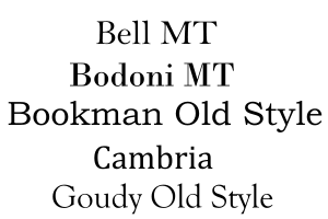 Photo Source: http://www.businessnewsdaily.com
2. Font – Don’t Make Me Get My Reading Glasses
As I get older, my eyesight is starting to deteriorate to the point where I got my first bi-focal lenses about two years ago. That’s one of the reasons that I like my Kindle. I can blow up the font to ridiculous sizes and put the glasses aside. I don’t, however, recommend making your font ridiculously large, but you should consider an 11 or 12 point font in either Arial or Times Roman when you format your book. If you make your font any smaller, you may save paper for your print book, but you may also lose readers like me with old man eyesight. I also have found that the demographic for the genre of my books tends to be more ‘seasoned’ citizens that prefer physical books. They appreciate the larger font.
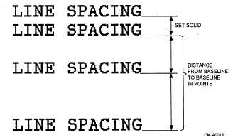 Photo Source: http://draftingmanuals.tpub.com
3. Spacing – Make it Readable
This topic has a lot of varied opinions, but I will give you some key rules that I follow. My books follow the rule of inserting a blank line between each paragraph and between a paragraph of narrative and a block of dialog. Additionally, I like to use proportional spacing. What this does is line the right side of your writing up along an imaginary straight line by spacing the words on each line proportionally. This eliminates the jagged edges within a paragraph. The last thing is to consider 1.5 spaces between each line instead of single-line spacing. I have two examples below, kind of a before and after, of each technique:
Option 1: Spacing rules not applied

Option 2: Spacing rules applied

You may not agree with the formatting differences, but it’s all a matter of preference. I find option two more aesthetically pleasing and easier to read.
 Photo Source: http://www.washingtonprospectors.org
4. Chapter Length
Some very famous traditionally-published authors use a common-sense technique that I like to use as well, keeping chapters short. Harlan Coben and James Patterson are both known for this. As someone who reads when I go to bed, I get annoyed by long and ponderous chapters that keep me from going to sleep. I hate stopping in the middle of a chapter, but sometimes I have to. If it’s a good book with short chapters, I will try to squeeze in one or two more. The short chapter length keeps me turning the pages. I usually try to keep the chapters at 1,500-2,000 words.
 Photo Source: http://www.timeprep.me
5. eBook vs. Print – They Are Not The Same!
Although Amazon and other platforms make it very easy to set up eBook and Print Book formats, these two media types are not the same and your formatting should differ. In a non-fiction book (traditionally), this starts with the table of contents. An eBook does not need page numbers in the TOC. It does, however, need hyperlinks. When I’m flying to some destination for my day job and we hit rough air and I touch some forbidden spot on my Kindle screen, I have booted myself out of books or have jumped to locations unknown. If I haven’t synced my book in a while, it can sometimes be difficult to remember where I left off. With hyperlinks, I can at least jump to the right chapter and not get too frustrated. For print books, page numbers are necessary in the TOC and in the book itself.
Also, it’s not necessary to put page numbers or page breaks in an eBook. In fact, it can look sloppy if you do.
 6. Front Matter – Yes it Matters
Front matter is that stuff at the beginning of the book like a title page, dedication, acknowledgements, copyright notice, disclaimer, and a table of contents. To make your book look like a real big-boy or big-girl book, you should be including these things. Some of them are also essential to protect yourself and your book. Let’s start with the title page and what should be on it. I’m including an example for you to refer to:
Title Page Example

This title page contains the title (duh) the copyright notice, and the disclaimer. These last two elements are essential to protect your book from piracy and to protect you from being sued. You’ll also notice that the front matter is numbered with lower case Roman numerals in the print version of a book.
The dedication, acknowledgments, and table of contents also appear in this front-matter section and should have the same page numbering scheme. You shouldn’t start normal numbering until the first page of the actual book.
Something that I also do in my front- matter that you’ll see in a lot of books is the addition of reviews of either the current book or other books by the author. You can do this if you have enough reviews to fill a page or two.
 Photo Source: http://newsroom.unl.edu
8. Table of Contents, Page Numbers, Page Header
For non-fiction books, the table of contents should go in the front-matter. If you are using Word, the automatically generated TOC will work for both eBooks and print. You just have to suppress including the page numbers for the eBook TOC. For page numbers, they should be placed in the center at the bottom of each page in the footnote area. For a page header, I like to put it in the heading area, right-justified, and in the format Author’s Last Name/Title. An example of these elements is shown below:

 Photo Credit: http://shellymartinez.net
7. Preview Chapters
Another technique that I borrow from traditionally published authors is the use of preview chapters. This is especially effective in a series of books. You can keep the reader’s interest up by putting the first chapter of your next book at the end of the current book. You may be thinking, “I haven’t written the next book yet, dummy.” And this may be true. As the release of your next book gets close, however, you can certainly change your existing book to have this preview chapter at the end. Your existing readers can usually re-download the eBook for free and your new readers will find it there and snap up your new book. I usually announce that I’m doing this and have gotten good traction, even from those that have already read the current book.
 Photo Credit: https://tolgatinkera2.blogspot.com
8. Write a Good Synopsis for Your Back Cover
A good 2-3 paragraph synopsis is something you can use over an over again. Most importantly, you can put it on the back over of your print book. If someone picks up a copy of your book, the natural tendency (after they marvel at your great cover) is to turn the book over and read the synopsis. You can also use it as the description of your book on your favorite eBook platform and as your “elevator speech” when someone asks you about your book in the hallway or…elevator. The synopsis should tell the reader enough of the story to entice them, but not give away key details or the ending. Think of movie trailers and television show teasers when you build your synopsis.
I hope these tips have helped you. As always, your comments and feedback are welcome.

Very helpful tips!!
LikeLiked by 1 person
Thank you.
LikeLike
Reblogged this on Stevie Turner, Indie Author. and commented:
Some good tips for formatting your book from Don Massenzio.
LikeLiked by 1 person
Thanks for the reblog.
LikeLiked by 1 person
You’re welcome.
LikeLiked by 1 person
Even the word terrifies me… Formating, to a three fingered typist (i do have all my fingers I just can’t get them to tap in any order) who has the technology skills of a duck billed Palatipus, you can I am sure imagine me cowering behind the chaise from *whispers* formatting. So I will pin this to be inspected in tiny increments so one day it will sink in. Thank you for sharing. 😉😉
LikeLiked by 1 person
You’re welcome. It’s not as bad as you think if you have the right tools.
LikeLiked by 1 person
And you have helped immensely.
LikeLiked by 1 person
Thank you, Don. These tips have helped a lot.
LikeLiked by 1 person
You’re welcome.
LikeLiked by 1 person
Reblogged this on Anna Dobritt — Author and commented:
Aside from bad editing, nothing annoys me more than a badly formatted ebook. There’s been at least one hundred ebooks that I stopped reading and deleted from my Kindle because of the bad formatting.
LikeLiked by 1 person
Thanks Anna
LikeLiked by 1 person
You’re welcome
LikeLiked by 1 person
Reblogged this on All About Writing and more.
LikeLike
A very informative post.Thanks for sharing!
LikeLiked by 1 person
Thank you.
LikeLike
You are welcome!
LikeLike
Reblogged this on Pizzazz Book Promotions.
LikeLiked by 1 person
Thanks for sharing this.
LikeLike
Pingback: 8 Tips For Formatting Your Book | turkmed
Thanks for sharing this
LikeLike
Reblogged this on Just Can't Help Writing and commented:
These tips from Don Massenzio may help you make formatting decisions. I particularly like the idea of using 1.5 line spacing instead of single spacing in print books. Maybe I’ll try that next time!
LikeLiked by 1 person
Thanks for sharing this.
LikeLike
Will definitely be stealing some of the ideas presented here. Thanks.
LikeLiked by 1 person
Great. Glad you found them useful.
LikeLike